Excel Dashboard Templates

Learn how to create Excel dashboards.

Tuesday, October 9, 2007

Dashboards in Microsoft CRM 3.0

A Microsoft CRM developer was telling me about his project to build some enterprise dashboards in Microsoft CRM. He showed me this post about CRM 3.0 dashboards.

Out of the box, there is no way to generate the dashboards that everyone is clamoring for. But, as the blog post linked to above shows, you can use the Microsoft CRM SDK to generate some very nice dashboards.

Here is a look at their very nice work. The charts are flash-based.


Monday, October 1, 2007

Security Dashboards

Dashboards for monitoring the status of network, web and email security are now common place. I can't think of many network security products that do not offer dashboards as the primary method of interacting with the end user.

Here are 2 dashboard screenshots of a security product.

You'll see liberal use of lights to show various states of key metrics.


Here is a closer look at one of the lower level pages:


Network Metrics Dashboard

Thursday, September 6, 2007

Business Intelligence Dashboard Vendor Landscape Report

Do you know the top five BI tool vendors of 2006? The Dashboard Spy knows. He has done it again with this post about a recent IDC ranking of business intelligence tool vendors. How does he come up with such interesting reporting on dashboarding news? Yes, as the Spy said, this Dashboard Guy wants to be like the Dashboard Spy.

As provided by the Dashboard Spy, here is the link to the IDC report excerpt entitled "Worldwide Business Intelligence Tools 2006 Vendor Share". as provided by BI dashboard vendor SAS.

Here are the market share and revenue statistics of the business intelligence tool vendors:

Be sure to click on this image to enlarge it for legibility.

Tuesday, August 14, 2007

Dashboard for Tracking Video Stream Metrics

Executive Dashboards are built to visually impart a sense of key performance indicators. You get to "feel" how your business is doing. The "intuition" that you get from using an enterprise dashboard is often the result of the various gauges, dials, charts and graphics on the dashboard.

Sometimes, however, you really need to see line items of data on your dashboard. Summaries of various sales figures, totals of financials, etc. This is often best accomplished by displaying small tables on the dashboard.

Here is a good example of the mix of graphic and tabular content that can be used on a dashboard. This particular dashboard screenshot is of an application built to track the metrics of a site that delivers streaming video and audio. Obviously, it is critical that the site owners see the reach of their content distribution. It has charts, graphs and a map. Additionally, there are several portlets that are table-based. To help legibility, the rows feature alternate-row coloring.

Click on the dashboard to enlarge the screenshot.


Tags: Dashboard, Dashboard Design, Executive Dashboard

Monday, July 30, 2007

Cholesterol and Triglyceride Monitoring Dashboard

One of the reasons that executive dashboards are the latest new thing is that they are so old. Is that a contradictory statement? No, the idea of an executive dashboard is comfortable because it seems so familiar to a range of users. Today, we all think of enterprise dashboards as web-based applications, but for years, the dashboard layout was a popular first view of a client-server or desktop application.

In that sense, many software architects used the application dashboard as a summary of key indicators, a jump-off point for navigation, and a way to make the look and feel compelling and useful. The dashboard as a UI design pattern has been sucessfully used for many years.

Today we look at a desktop application done in an executive dashboard style. This cholesterol and triglycerides monitoring dashboard allows the user to manage their cholesterol management regimen. The left side navigation includes doctor, exercise, diet, data, library, money and preference sections. Right side portlets include content such as to-do lists, email reminders, tasks, lab results and charts of the user's cholesterol and triglyceride levels.

Click on the screenshot of the monitoring dashboard to enlarge your view:


In terms of the design, it is functional, but I think there is a slight problem with the left side navigation. I am assuming that the onstate left nav bar is the doctor tab (as evidenced by the appearance of the sub-level navigation panel in blue). However, shouldn't the left navigation drive the right-side content? If so, the right side should show doctor-related content? Maybe it does, or maybe the first left side navigation item should be "My Dashboard".

Tags: Monitoring Dashboard, Executive Dashboard Design, Dashboard Example, Business Intelligence

Favorite links: Executive Dashboards by The Dashboard Spy

Friday, July 13, 2007

Websphere Dashboard for Insurance KPIs

This executive dashboard was produced with the IBM Websphere Portal Server and their Portlet Factory using the Websphere Dashboard Framework. Typical of executive dashboards, it provides a visually-based summary of key metrics and KPIs. It is a business dashboard, in this case, created especially for the insurance industry.

Click on this screenshot to enlarge the view of this executive dashboard.


Executive Dashboard Screenshot of Insurance Metrics

The Insurance KPI dashboard shows the overview tab which summarizes performance metrics such as Premiums Revenue Tracking, Number of New Policies Written, Average Policy Size, Underwriting Analysis and Underwriting Speed.

IBM does not support this particular dashboard as a product, but does offer the code for download to the dashboard development community as a jump start to an insurance industry dashboard. If you are developing dashboards with IBM Websphere Portal Server, check out the code download page for the IBM Dashboard KPI for Insurance.

Tags: Websphere Dashboard, Websphere Portal Dashboards, Insurance Dashboards, Executive Dashboards

Thursday, July 5, 2007

Creating Traffic Light Indicators in Xcelsius Using the Bubble Chart Component

Those of us using Crystal Xcelsius for executive dashboards often wish there was an out-of-the-box component for traffic light-style performance indicators. Red/Green/Yellow indicator lights are universally understood as indicators of state and are universally found on practically all executive dashboards. In fact, most business executives actually think in terms of green/red, good/bad modalities.

The author of my favorite book on Crystal Xcelsius ( Crystal Xcelsius For Dummies ) has an article where he shows step by step instructions on how to produce these neat executive dashboard traffic lights (click on the images to enlarge if necessary):


The basic idea is to use the built-in bubble chart component and strip everything out except for the bubble. Here is the usual bubble chart:

This link to the Xcelsius traffic light tutorial is definitely worth visiting. The author carefully illustrates each step that he takes, including the construction of the underlying excel spreadsheet and how to tie the series into Xcelsius.
Tags: Xcelsius Dashboard Indicators, Executive Dashboards

Thursday, June 21, 2007

PGA Executive Dashboard for Media Convergence

Executive dashboards replacing TV? The idea of watching a sports event on the web instead of on television has been kicked around for a long time. The rationale is that the web can offer interactivity and drill down capabilitiy that the TV set just can't (forget about the age-old pursuit of interactive TV - it's like looking for the fountain of youth!). Now with the widespread adoption of digital dashboards, it looks like it is now ready for prime time.

Well, in today's Executive Dashboard post, here is a dashboard screenshot taken while some avid golf enthusiast was watching a PGA tournament online. It comes from this post at skye journal. It has a skype conferencing window on the left so that he can chat with fellow fans (the ultimate live color commentary), a golf tournament dashboard provided by pga.com in the middle and a slingbox video feed on the right.

Note that in this paradigm, the actual video is all the way on the right. What is more important is the interaction with fellow fans and monitoring relevant KPIs, metrics and statistics via the golfing dashboard. Is this the future of television? Will people be dialing it to their executive dashboards?
Here is the executive dashboard screenshot. Click on the dashboard to enlarge the image.

Tags: Interactive dashboard, executive dashboards, enterprise dashboards, golf dashboard

Friday, June 8, 2007

Executive Dashboard Project Sponsor Wants a Bigger Logo?

"Don't want to tell you how to do your job, but make the logo bigger. Make the logo as big as you can." Sounds familiar right? We've all been on projects where we get design advice. How to handle this?

Over at the enteprise-dashboard.com collection of executive dashboard screenshots, there is a pointer to a hillarious graphic design song (bet you didn't know that was a genre of music!) called Make the Logo Big.

The direct url to the song is

http://www.underconsideration.com/MaketheLogoBigger.mp3

You can read more about it at http://www.enterprise-dashboard.com/2007/06/08/make-the-logo-bigger-please/

Tuesday, June 5, 2007

Executive Dashboard for Sales Representative Metrics

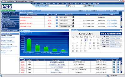
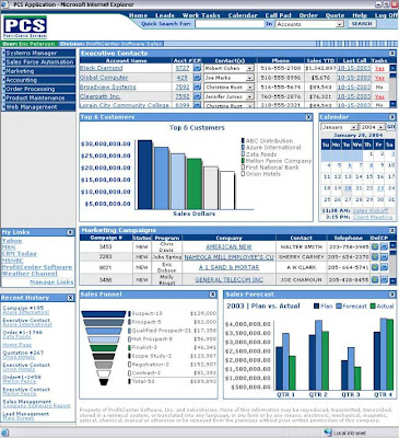
Today's executive dashboard screenshots serve sales representatives and sales executives by providing role-based display of metrics and KPIs critical for monitoring the company's marketing and sales activities. The enterprise dashboards are composed of portlets or widgets that contain content in the categories of financials, marketing activities, sales force automation (SFA) and standard portal functionality (calendar, links, history, etc.)

This first business intelligence dashboard shows the content that a sales representative receives upon loggin in to the application. The view is quite SFA-centric, with the list of accounts, contact information, top customers chart, calendar and contact information right at the top of the fold. The lead stage contact information is shown along with each lead's status information.


This next executive dashboard is for the business user role of sales manager. Note that in addition to the metrics and kpis available to the sales representative, the sales manager also sees sales cycle metrics and marketing campaign status.


Remember to click on the screenshots above to examine these executive dashboards in detail.

Tags: Executive Dashboards, Sales Dashboard, Marketing Dashboard

Thursday, May 31, 2007

Executive Dashboard for Wireless Network Metrics

Executive dashboards provide at-a-glance summaries of key performance indicators in a highly visual manner. This allows for quick understanding of metrics that spreadsheets simply can't provide. These executive dashboard screenshots show how a wireless provider uses executive dashboards to monitor the health of their network.


The wireless network operator is innundated with performance data. The trick is to translate the overwhelming number of data points into not just network performance trends, but, more importantly, into real management metrics.


This first executive dashboard screen is straight-forward and is composed of four graphs. Click on the dashboard screenshots to enlarge the views:


One of the most common requests by users of an executive dashboard is the ability to select reports and customize their views. These next two dashboard screenshots show how this is done in this dashboard system.


In the above screenshot, the user selected the reports they wanted to appear. In the screenshot shown below, the user can configure the charts and graphs themselves.


Wednesday, May 16, 2007

Executive Dashboard Shows Project Status At A Glance with these Colorful Indicators

Executive Dashboards are visual in nature of course, but have you ever seen a dashboard with only big red, green, and yellow indicator lights? The design of this executive dashboard is slick and works well. They augment the information with hover-over, tool tip-type of explanations.

This executive dashboard tracks IT projects. There are 2 tabs - dashboard and builds. This screenshot of the dashboard shows the status of the projects by color. Green shows successful builds, red shows broken builds, yellow shows that a build is in progress and the grey indicates that the build has not yet occurred. And, yes - your eyes are OK, the colors are soft (a web 2.0 style influence and perhaps an aid to black and white printing).


This next screen shows the Builds view. It is also graphically oriented.


This final dashboard screenshot shows the detail view. As a more data-intensive screen, it has more text, but it also starts off with a big icon to show the state of the build:


Monday, April 9, 2007

Law Firm KPIs & Metrics on an Executive Dashboard

This series of excellent executive dashboards focuses on law practice management via monitoring financial and client KPIs. They are the output of a hardworking executive dashboard guru at the law firm of Bryan Cave. Based on Redwood Analytics, these dashboard screenshots show exactly what gets a lawyer's juices going. Take a look at these metrics. This first dashboard screenshot starts off with a listing of clients and their attributes (fees collected, fees billed, collection contribution, billing contribution, effective rate, collection realization).

Click on the images below to open them fully to see all the details of each executive dashboard.


Upon drilling down into a client's details, we see financial metrics such as speed of collection, accounts receivables, and most interesting, how such KPIs for this client compare to firmwide metrics:


Gauges allow for a visual depiction of the financial metrics on this executive dashboard:


Finally, we get to see the planning module where each lawyer can plan out how much each engagement can contribute to their numbers.


Tag: Executive Dashboard