Take a look at the charting options made possible by Microcharts, a charting solution for Excel used by many business dashboard implementation teams.
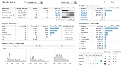
Here's a good example of a management dashboard with sparklines and bullet charts.

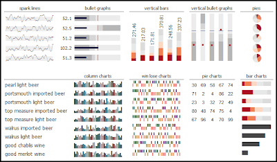
Here are some sample charts:

There is an online demo of this Excel management dashboard.
No comments:
Post a Comment